CASE STUDY

Building a clear wellness website around classes, trust, and booking.

Kerala Yoga needed a simple website that made it easy for visitors to understand the classes, compare options, learn about the teachers, and take the next step toward booking.

CLIENT

Kerala Yoga

INDUSTRY

Health & Wellness

SERVICES

UX Structure · Booking Flow

PLATFORM

WordPress

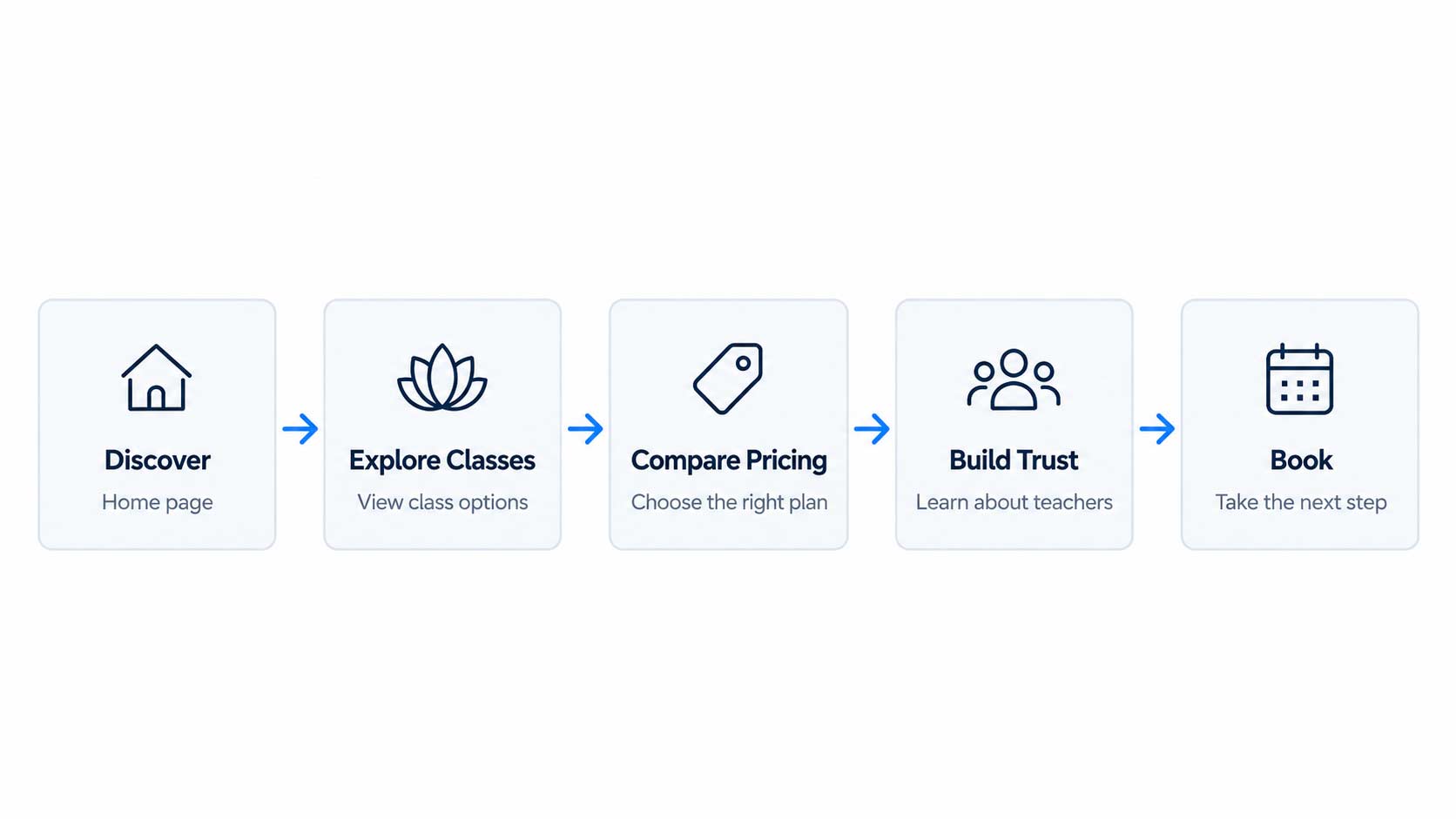
USER JOURNEY

A simple path from discovery to booking.

PROJECT CONTEXT

A wellness website built around clarity and trust.

Kerala Yoga offers multiple class types, pricing options, instructors, and locations. The website needed to bring those pieces together in a way that felt simple for visitors to understand.

The focus was not technical complexity. It was creating a clear structure that helped people quickly find the right class, understand pricing, learn about the teachers, and feel confident taking the next step.

QUICK FACTS

Industry

Health & Wellness

Project Type

Wellness Website

Platform

WordPress 

Focus

UX Structure + Class Discovery

Build

Design + Development

The Challenge

Making multiple wellness offers feel simple.

Kerala Yoga offered different class types, pricing options, instructors, and locations. Without a clear structure, visitors could easily lose track of what was available or what to do next.

The challenge was to organize that information into a simple website experience that helped people understand the offer, build trust, and move toward booking without unnecessary friction.

KEY UX DECISIONS

Simple decisions that made the website easier to use.

DECISION 01

Classes first

DECISION 02

Pricing kept separate and clear

DECISION 03

Trust before action

DECISION 04

Booking stays visible

Visitors can quickly see the available class types and understand what each option is for.

Class cards and single-class pricing are presented in one dedicated place, reducing confusion before booking.

Teacher profiles, the brand story, testimonials, and location information help visitors feel more confident before taking the next step.

The “Book a class” action is kept prominent across the website so visitors always know what to do next.

Interface Highlights

Selected screens that show the UX decisions in practice.

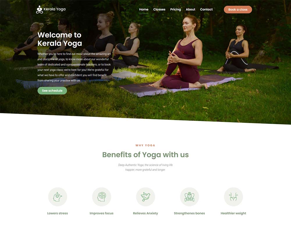
Clear starting point

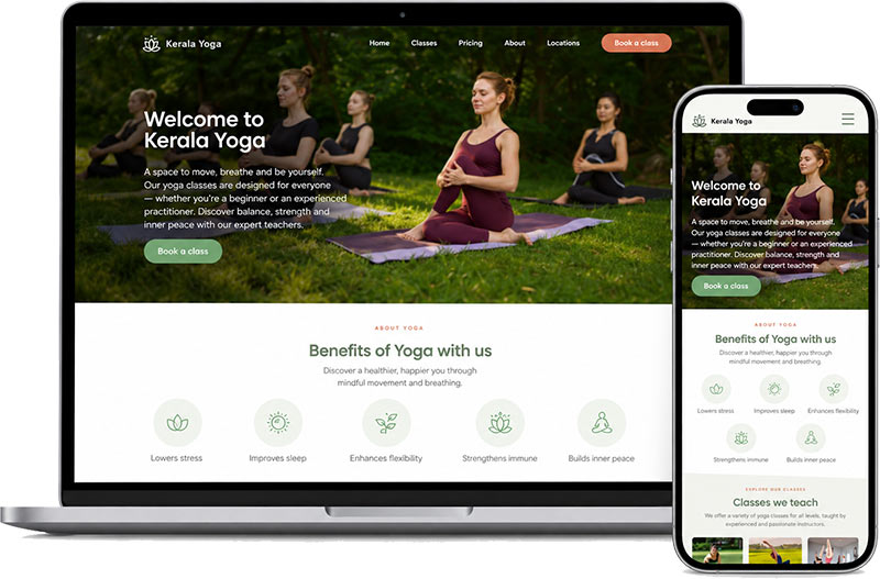
The homepage introduces Kerala Yoga, surfaces the main class options, and keeps the booking action visible so visitors can quickly understand what the business offers.

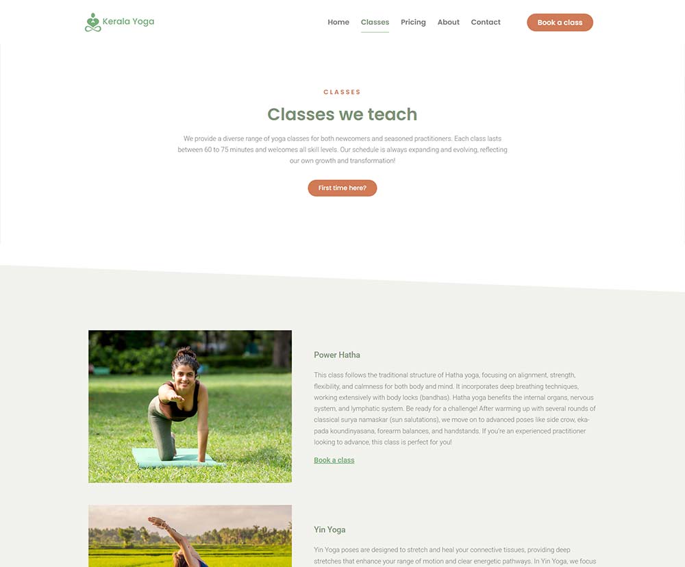
Easy class discovery

The classes page separates each yoga option into a clear section, helping visitors compare class types and find the one that fits them best.

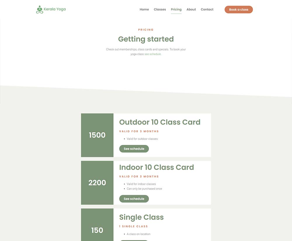
Simple comparison

The pricing page keeps class cards and single-class options easy to scan, reducing confusion before a visitor decides to book.

Clear inquiry path

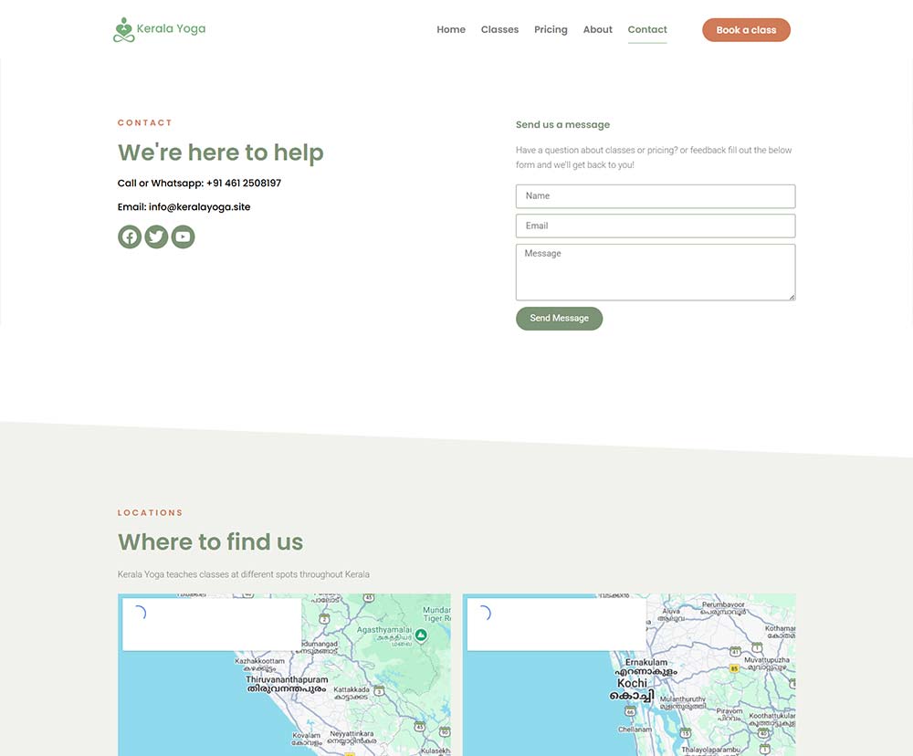
The contact page keeps essential contact details, the inquiry form, and studio locations together, making it easy for visitors to ask questions or find where classes are available.

Outcome

A clearer, more connected website system.

The contact page keeps essential contact details, the inquiry form, and studio locations together, making it easy for visitors to ask questions or find where classes are available.